Too few homes, in the wrong place
With such a shortage of housing it matters more than ever that what we do build is where it is needed most. Here I’ve mapped what’s happening across Britain, and the results are not encouraging.
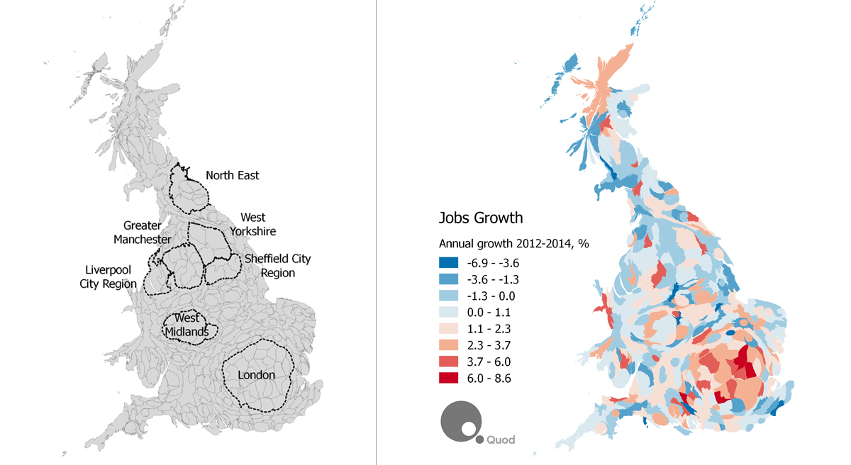
First, a word about the maps themselves. These are “cartograms” – maps that have been distorted in proportion to population. Cities are stretched, and countryside squashed until any two equal areas represent the same number of people.
This sacrifices accurate physical geography for a much better picture of human geography. It avoids the problem of small urban districts – where most of us actually live – not showing up compared to large rural districts.
So, these cartograms even things out. To help navigate the unfamiliar shapes, I’ve outlined some of the emerging city regions.
If the shapes show where people live now, the colour in the maps at the top show how that’s changing. The first map at the top is population growth, with almost everywhere growing, including cities such as Bristol, Manchester, Leeds, Coventry. But the dominant picture is of strong growth around London and the South East.
The second map shows how the number of homes is growing, on the same colour scale. What is striking is how much more evenly-spread the growth of housing is – without the extremes of blue and red. There are areas with falling population where housing has still grown a little, and there are areas with surging population where housing has also grown. A little.
The 50 fastest-growing local authorities have populations increasing by an average of 1.7% a year, but housing stock growing at only half this rate (0.84%). Picking out just the ten fastest growing areas, population growth averaged 2.3% a year, but the number of homes still only grew by an average of 0.84% a year.
Not only are we building too few homes, those that we are building are not where they’re most needed. I should be clear I’m not suggesting that too many homes are being built outside the South East – there is population growth almost everywhere and a need for significant numbers of homes in most metropolitan areas across the UK. The problem is that the areas with the greatest need are not managing to deliver many more homes than the areas with more moderate need.
It would be wrong to believe this represents some kind of helpful “rebalancing” of growth across the country. The last map shows where jobs growth is1, and this makes clear why the population of the south east is growing so rapidly. People want to be where the jobs are, and if housing shortages price people out of those cities, the economy as a whole will lose out.
We need to invest in cities across the country so more of them can succeed, but the surest fix for Britain’s productivity problems would be housing that allowed those who want to move to high-productivity cities to do so.
————–
Note on Data and Sources
The maps show average annual percentage growth over the last couple of years – in almost all cases from mid-2012 to mid-2014 – at local authority level. The data comes from the Office for National Statistics, Scottish Government Statistics Group and Statistics for Wales. Population is residence-based and jobs are workplace-based. Note that housing growth here is based on changes in net dwelling stock (not gross housebuilding) therefore takes account of conversions and demolitions.
1 Caution is needed when using a population cartogram for jobs, as this “under-represents” commuter destinations, particularly the City of London, and “over-represents” dormitory towns.
PS. See also coverage of this research in The Independent


